
_edited.jpg)
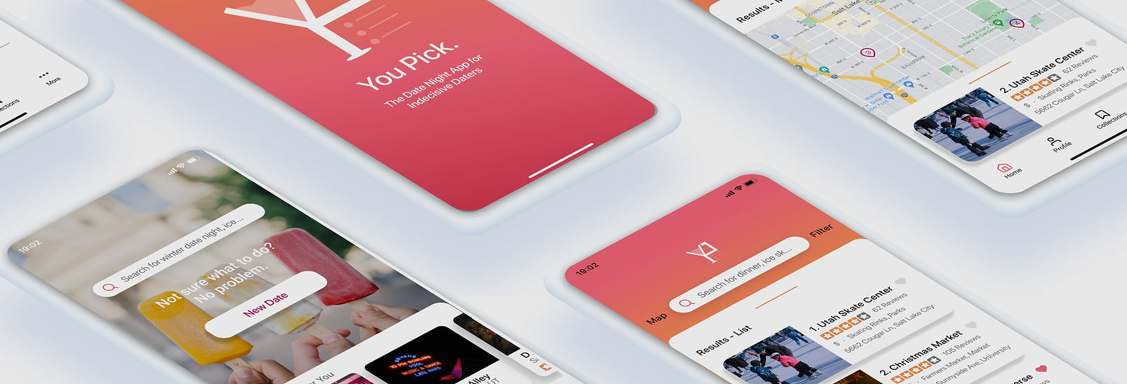
YOU PICK
Tools
Figma
Team
Haley Meyer
UX / UI Designer
Project Goal
Depending on a person’s relationship status, whether it be newly dating or married, the favorite “Friday night dinner spot” or the monthly movie night complete with buttery popcorn can grow old. The issue after meeting on a dating application or falling into the daily routine of marriage is that it becomes hard to think of new adventures to go on together. You Pick streamlines the confusion that is normally found when figuring out a plan for a date night, and will create more opportunities to spark creativity among couples.
Competitive Analysis
In my competitive analysis, I looked for location based search patterns within Zillow and All Trails. I also analyzed the applications for their horizontal navigation bar interactions located at the bottom of the screen to look for similarities of where to place home, profile, and collections interactions.
The most important takeaway came from Airbnb, where I was able to gather similar patterns from their “I’m flexible” format. By distilling information down into questions, this allows the application to gather from the user the type of experience they want out of their date night. This reinforced the concept of a straightforward distillation of information even when the user might not fully know what they want.


Site Map and User Flow
Wireframes
Upon completing the site map and user flow, the key element so that the user could land at the final result came from a need to break down what the user did or did not want out of their date night.
By asking a series of questions, the application could gather more information from the user. In the end, they could land at their final desired date night that provided location specific details.
I created low-fidelity wireframe sketches to better understand the interactions between the user flows.

Wireframe and Prototype

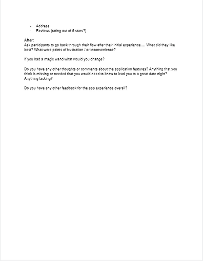
Moderator Guide and User Testing
I created a moderator guide that allowed me to follow a consistent interviewing process, ensuring that moderator questions were not too leading. With this guide I conducted 3 interviews, recording video via Zoom and then scribing my results in Figjam.

After concluding the interviews, the participants had a plethora of overlapping conclusions, including:
-
Keep questions to a minimum... “anything more than like 6 questions is too much... like an in depth dating profile”
-
Some questions need to be more specific...“showing the exact price to match what was asked in the questions ($-$$$) would be helpful. What is $ to me could be $$$ to someone else”
-
General dislike for the color palette chosen..."Dislike background color.... possibly something more “romantic” or “softer”


Accessibility
The You Pick application is designed to be accessible and usable for all. I designed the accessibility to meet AA and AAA standards. All crucial portions of the application that require navigation and text visibility were amended for required font size to meet the strictest of accessibility standards which are seen in the style guide.

